AmitPL Website Redesign
The AmitPL website redesign project aimed to enhance the user experience, visual appeal, and interaction design of the company's online presence. By modernizing the layout, refining the content structure, and incorporating engaging design elements, the new website better aligns with AmitPL’s innovative and professional identity. The redesign prioritizes intuitive navigation, responsive design, and accessibility, ensuring a seamless experience for corporate clients, partners, and job seekers while reinforcing trust and credibility.
01
Problem Statement
The current Amit PL website presents several challenges that hinder its effectiveness in engaging the target audience. These issues include:
Outdated Visual Design: The website's appearance fails to reflect the company’s professional and innovative identity, making it less impactful for corporate clients and collaborators.
Unstructured Content Hierarchy: Important information is not organized intuitively, leading to difficulty in navigation and preventing users from quickly accessing key details.
Lack of User Engagement: The absence of interactive elements, modern animations, and clear call-to-actions results in a static and uninviting user experience.
Accessibility and Mobile Responsiveness: The website does not adequately cater to mobile users nor meet accessibility standards, limiting the usability of the website to a wider audience.
Limited Credibility Features: There is no emphasis on presenting testimonials, case studies, or industry certifications, which are important for trust and authority among potential clients.
02
Target Audience
B2B Clients
Corporate Professional and Decision-Makers
Partners and Collaborators
Job Seekers
03
Constraints and Requirements
Constraints included working within the existing branding guidelines, ensuring technical feasibility, and maintaining accessibility standards. The project also had time constraints, limiting the number of iterations.
04
Design Decision
Key Features:
Clean modern layout with structured content hierarchy.
Vertical section tracker to help navigate and make users aware.
Ubuntu and Lato typography gives a professional and approachable look.
Sticky navigation bar with a clear call-to-action to engage the user.
Justification:
All the features were selected to specifically address user needs and meet company objectives. For instance, the section tracker gives users a feeling of progress. The typography ensures readability as well as a polished appearance.
Challenges and Solutions:
Challenges were related to balancing visual appeal and usability, ensuring accessibility by everyone, and time constraints. The solutions were prioritizing major aspects in the design, carrying out usability testing, and using modern design tools in order to make the whole process more efficient.
05
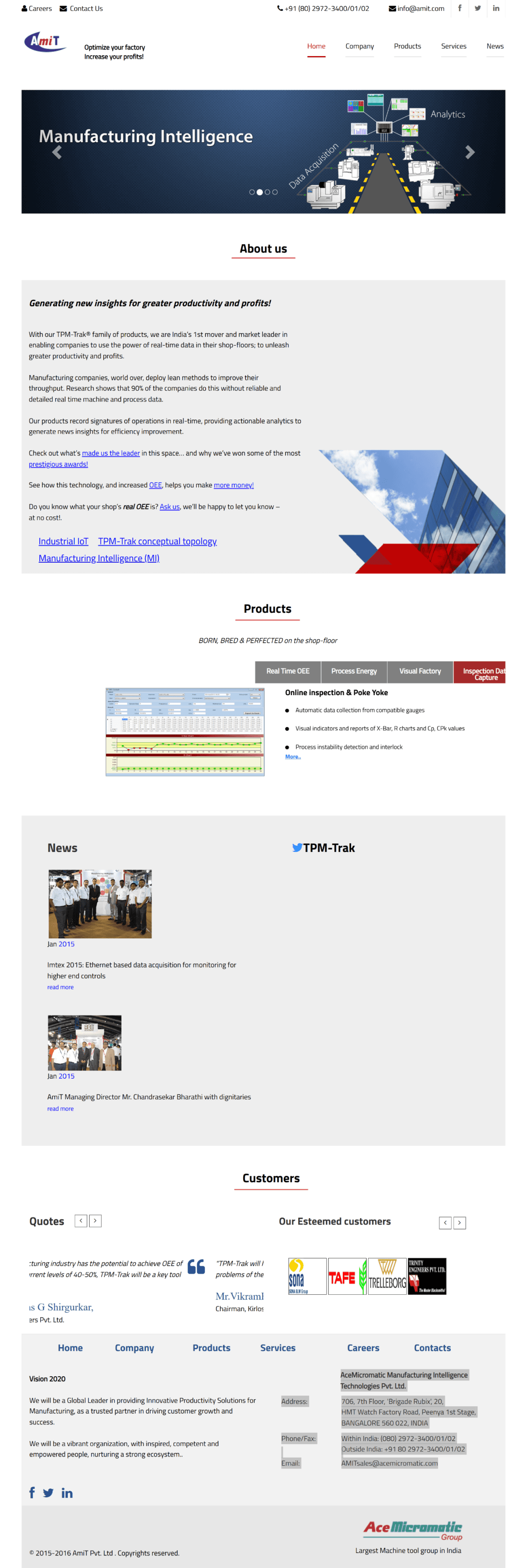
Previous Design
06
My Design Rationale
This is the new recommended design based on my explorations.
